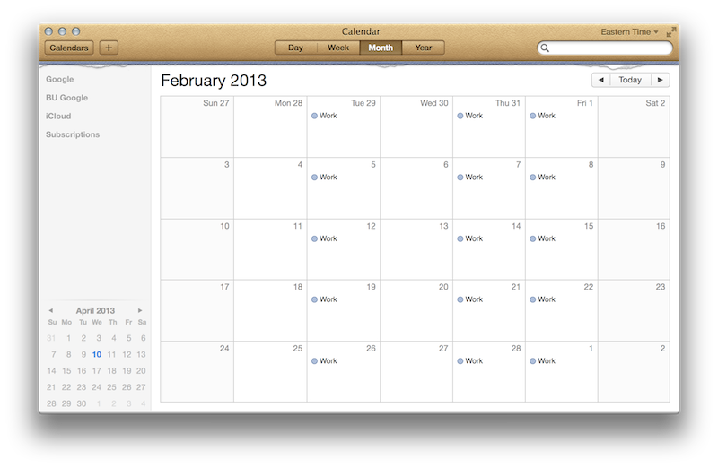
Many words have been written recently about the realism in the design of Apple’s interfaces, and the benefit (or lack thereof) of skeuomorphisms. I would like to attempt a slightly different argument, and examine the philosophical ramifications of Apple’s design decisions. A word of caution though, I am neither an interface designer nor a philosopher, so the most I can hope for is to not butcher either. I will also offer the warning that this is meant to be an intellectual exercise, and not indicative of my feelings towards Apple, Platonism, or Calendars.
Platonism is the philosophy that suggests that for every “object” there is a pure abstract version of that object that exists somehow outside of this world. Consider an apple sitting on a table. The apple is just an instance of the abstract idea of an Apple. The same is true for the color of the apple. If it is red, this is just an instance of the idea of Redness. This idea should be easy to grasp for computer scientists, since we deal with Platonic Forms all the time in the guise of objects and classes. We even go so far as to create our own Forms!
But what does platonism have to do with Apple’s interface design? User experience is hardly a philosophical endeavor! Except that it is. Given the task of designing a calendar application, one has to consider what a calendar Is. This encompasses everything from the calendar’s appearance to its behavior to its limitations. In a very direct way, UX is the identification of the Form of what is being designed. A calendar application is an instance of a Calendar.
A defining quality of a Platonic Form is that it is ineffable. Our mere existence will never be able to truly perceive the object as it really is. As a result, there is a lot to learn from observing other’s attempts at defining these Forms. Examining the trade-offs and decisions made in the design of a calendar is enlightening as to what its designer thinks embodies the Form of the Calendar. In the case of Apple, it is almost trivial to define exactly what they think is the platonic calendar: a fancy executive-style desk calendar.
There are a couple of interesting consequences of this decision. The first being that it is relatively easy from a designer’s point of view to decide the appearance and behavior of your calendar; it should look and behave like the real object. Also interesting is how discrepancies between the virtual calendar and the True Object are rectified. In Apple’s implementation they discretely add features that the program should have to the context.
Perhaps the most interesting though, is thinking about what it means for an object in a computer to have its Platonic Form be an object in the real world. This would imply that for objects in a computer, like a calendar application, their zenith is their real-world equivalent. As history has shown, this is far from the case, as computer applications have surpassed their real world counterparts in nearly every way.
Let’s consider the calendar application further. Ignoring the uses of sharing calendars across networks, the virtual one still more useful than the physical object, if only for its ability to handle more information and dynamically adjust the events it is displaying. The only way that a physical calendar may be preferred is because it is tangible, and the virtual one is merely a representation.
But this is in a sense exactly the distinction between the Form of an object and the object itself. An instance of something is just a shadow of the object as it exists in the world of platonic ideals. In order for Apple to design a better calendar they have to make it tangible in some way. From this angle, the emergence of the iPhone and the iPad seem almost obvious. Obviously Apple didn’t conceive of the iPhone to make their calendar closer to a Calendar, but the logic still holds to a degree. In order to design a better user experience, Apple had to find a closer approximation of the platonic ideal and the route they picked was to create an experience that better mimics the ideal by being tangible.
At this point though, Apple is in a bind as they are sitting on a philosophical minefield. They must either must either continue attempting to improve their user experience by integrating more and more of the real world into their designs (culminating in the Apple Desk Calendar perhaps?), or they must reject their reliance on the real world as a the world of platonic forms and seek some higher representation of the calendar. Time will tell.
I mentioned before, but I’d like to reiterate: I most emphatically don’t buy my line of reasoning above. This was an intellectual exercise, not an attempt at depth.
Edit from 10/22/2013 – With the Release of OS X Mavericks and its abandonment of physical looking calendars, I have to say that my analysis here worked out far better than I would have anticipated.
